Our New Pride Logo: A Symbol of Our Commitment to LGBTQIA+ Equality
Introduction:
At Brillband, we believe that everyone deserves to feel safe, respected, and included. We are committed to creating a workplace where all employees can thrive, regardless of their sexual orientation or gender identity. Equality is a key pillar this business is built on.
Background:
In June, we celebrate Pride Month, a time to commemorate the 1969 Stonewall uprising, which is widely considered to be the start of the modern LGBTQIA+ rights movement. The Pride Progress flag was created in 2018 by Daniel Quasar, and it includes five additional stripes: black, brown, pink, light blue, and white. These stripes represent the black and brown communities, trans people, those living with HIV/AIDS, and those who have been lost to hate crimes.
Design process:
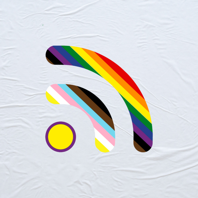
Our Marketing Manager worked with our LGBTQIA+ team members to design a logo that represents all the colours of the Pride Progress flag. We wanted to create a logo that would be both visually appealing and meaningful to the LGBTQIA+ community.
Impact:
Our pride logo is a symbol of our commitment to LGBTQIA+ equality. We want to show our employees, customers, and partners that we are a company that values diversity and inclusion and that we stand against hate and prejudice.
Conclusion:
We are proud to support the LGBTQIA+ community. We believe everyone deserves to be treated with respect and dignity, regardless of their sexual orientation, race, religious beliefs or gender identity. We will continue to work to create a workplace where all employees can thrive and educate one another about the communities they associate themselves with to promote understanding and love.
Love Duncan & The Brillband Team